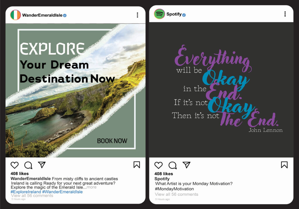
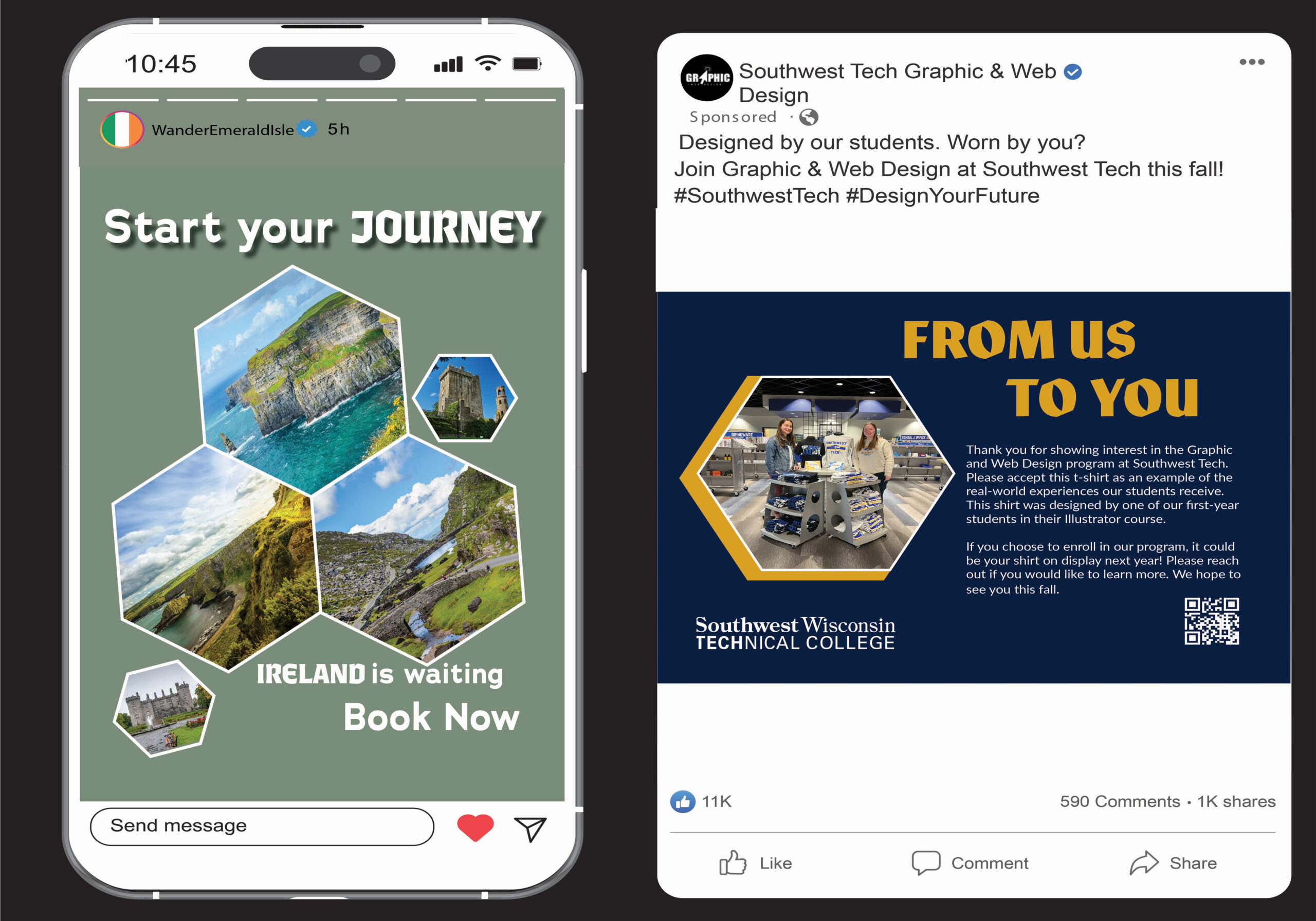
These social media designs use strong layout, typography, and visual hierarchy to capture attention and guide the viewer’s eye. The WanderEmeraldIsle travel posts feature a muted green background paired with vibrant landscape photography, creating a balance of serenity and adventure. Bold, medieval-inspired typefaces mixed with clean, modern fonts highlight important calls to action like “Book Now.” The use of hexagonal photo frames adds structure and visual interest while maintaining a cohesive, inviting aesthetic.
The Spotify and Southwest Tech designs focus on dynamic typography and brand consistency. Spotify’s playful, colorful text arrangement conveys energy and optimism, aligning with the John Lennon quote. Southwest Tech uses a bold navy and gold palette with a structured layout to emphasize professionalism and clarity. Repeated hexagonal shapes tie the designs together visually, while thoughtful contrast and alignment create a strong, engaging presence across all platforms.